Sydnee Williams
Line Quality Drawing
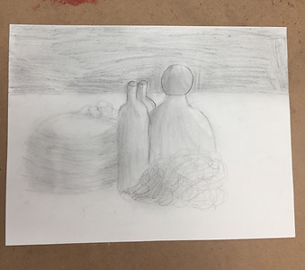
I drew my line quality drawing like this because I wanted it to look real. I made one side of the object lighter to show that the light was coming from one of those directions. For the other side of the object, I made it darker to indicate that the light was not coming from that way so therefore it should be darker. My inspiration for my work or for the way I drew my picture this way was the items set out on the table, I wanted to show good line quality and texture in my picture, to really show how emotional and real the picture is. The drawing was supposed to have 3 cups/vases, string, wire, and a baseball on top of one of the vases. My picture ended up looking like this, with lots of detail to support the drawing. Something I changed about my drawing compared to what it originally was supposed to look like is the baseball on top of the vase. It turned out to just be a ball because I really wanted the ball to have more detail than to have the baseball have distractions on it by adding the lines onto the baseball. Something I think I did well on was the lighting, and having an emphasis in my drawing. I think I did well in having an emphasis in my drawing because you can really tell where the light is coming from and it shows how dark the other side of the objects are. Some of the challenges that I encountered was the highlights and dark spots. I think I was really good with the lighting, but I think I could do better in indicating where the highlights should be from where the lighting is coming from. How I made the darkness and highlights better was by using both erasers and erasing the parts of the objects that the light is glaring at onto the object. How I grew as an artist/ person is by learning how to use line quality and how to show in a picture where you should add dark spots and highlights, which I think is very important to know as an artist/ person for future pictures. Something I learned from this drawing is that its ok to use all of the products you are provided with because the more you use the better your picture will turn out to be.
